11.45 Line Chart Basic
20180603
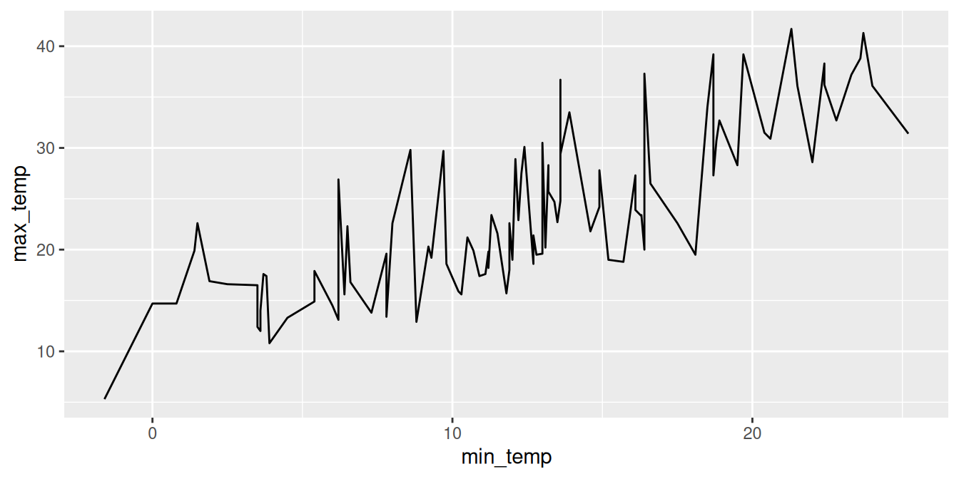
As an alternative to plotting the points we could join the dots and plot a line. One reason for doing so might be to attempt to observe more clearly any relationship between the two dimensions (i.e., the two variables we are plotting). Add a ggplot2::geom_line() to the canvas we can draw a line from left to right the follows the points exactly. The result is a rather jugged line and it is debatable whether it has added any further insight into our understanding of the data.
Your donation will support ongoing availability and give you access to the PDF version of this book. Desktop Survival Guides include Data Science, GNU/Linux, and MLHub. Books available on Amazon include Data Mining with Rattle and Essentials of Data Science. Popular open source software includes rattle, wajig, and mlhub. Hosted by Togaware, a pioneer of free and open source software since 1984. Copyright © 1995-2022 Graham.Williams@togaware.com Creative Commons Attribution-ShareAlike 4.0