11.10 Bar Chart Flipped Colour Mean no Legend
20200608
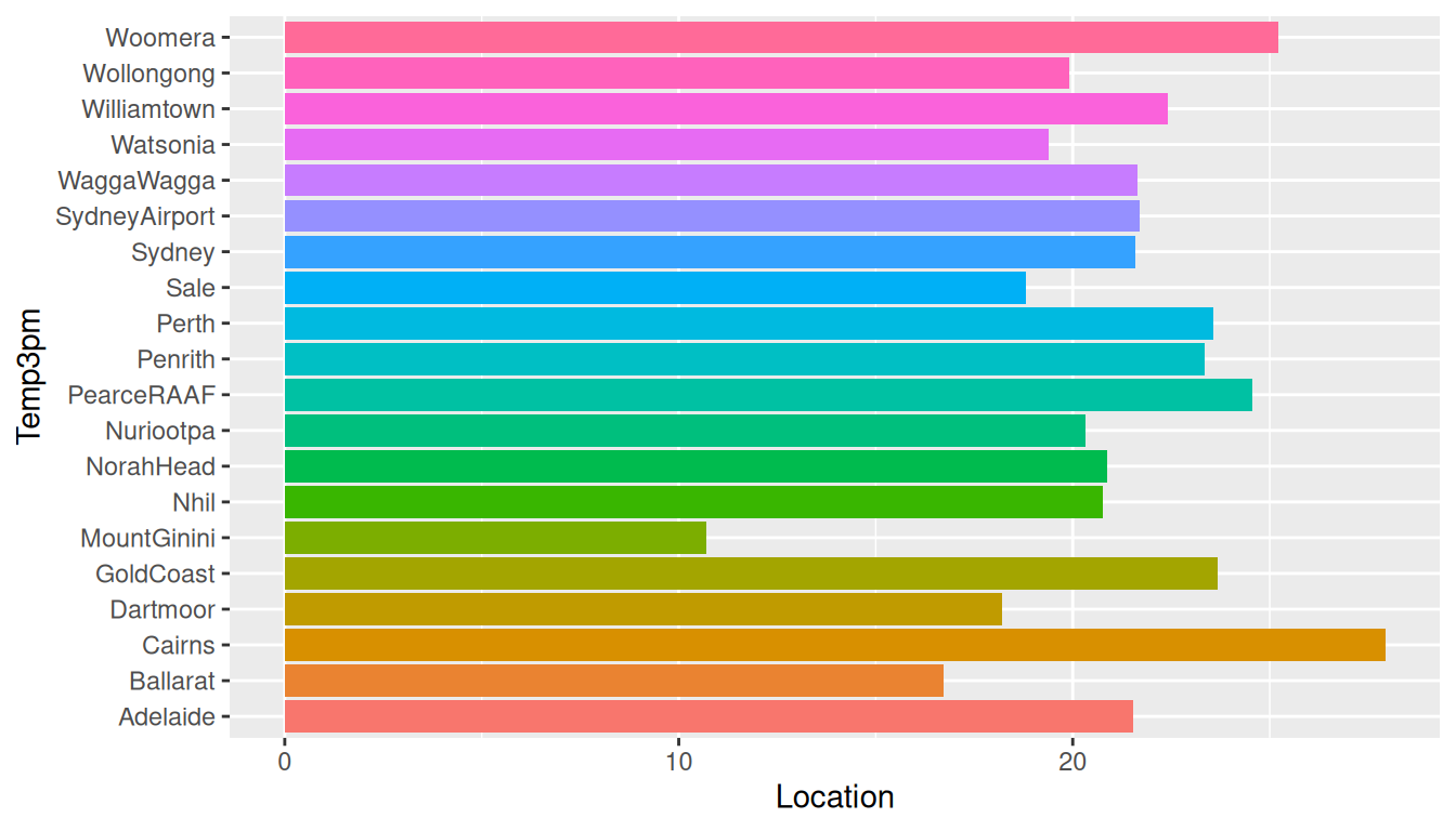
ds %>%
  filter(location %in% (ds$location %>% unique %>% sample(20))) %>%
  ggplot(aes(location, temp_3pm, fill=location)) +
  stat_summary(fun="mean", geom="bar") +
  theme(legend.position="none") +
  labs(x=vnames["temp_3pm"], y=vnames["location"]) +
  coord_flip()
Use ggplot2::coord_flip() to flip the coordinates and produce a horizontal histogram. Rotating the plot is generally useful when there are a large number of factor levels to fit on the x-axis. It is also easier to read the labels left to right rather than bottom up as we would need to do for the original plot.
For clarity of presentation here we reduce by using a dplyr::filter() the number of locations, selecting a random base::sample() of the base::unique() locations.
Colour is added through introducing a fill= option to the
ggplot2::aes(). The bars in the chart generated using
ggplot2::stat_summary() report on the
base::mean() of the temperatures as recorded at 3pm daily for
each location. The legend is removed through the ggplot2::theme().
Your donation will support ongoing availability and give you access to the PDF version of this book. Desktop Survival Guides include Data Science, GNU/Linux, and MLHub. Books available on Amazon include Data Mining with Rattle and Essentials of Data Science. Popular open source software includes rattle, wajig, and mlhub. Hosted by Togaware, a pioneer of free and open source software since 1984. Copyright © 1995-2022 Graham.Williams@togaware.com Creative Commons Attribution-ShareAlike 4.0