11.15 Bar Chart Labels
20210413
## Warning: Removed 1 row containing missing values or values outside the scale
## range (`geom_bar()`).
## Warning: Removed 1 row containing missing values or values outside the scale
## range (`geom_label()`).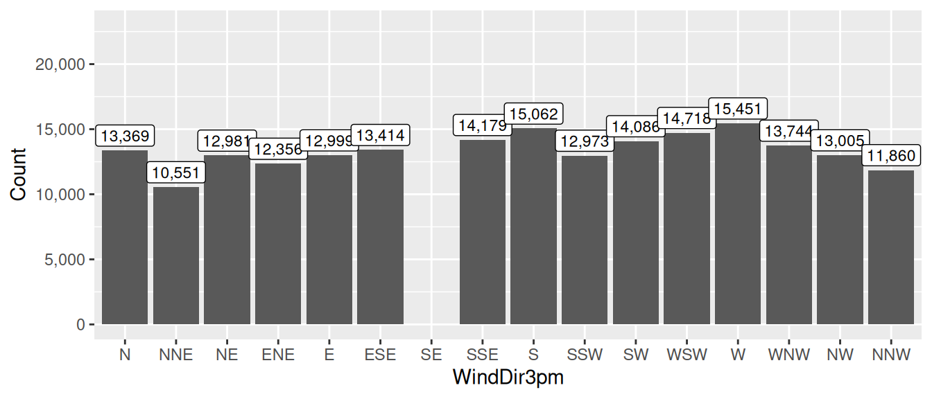
ds %>%
  ggplot(aes(x=wind_dir_3pm)) +
  geom_bar() +
  geom_label(stat="count", aes(label=comma(..count..)), vjust=-0.2, size=3) +
  scale_y_continuous(labels=comma, limits=c(0, 23000)) +
  labs(x=vnames["wind_dir_3pm"], y="Count")
A ggplot2::geom_label() can be used to add highlighted labels to a chart. Here for example they are added to a bar chart. Also see Section 11.20 to add just text and and ?? to add labels to a bar chart with dodged bars.
Notice the use of scales::comma() for the labels as should be standard practice.
To tune the plot we’ve increased the y-axis to fit the label using the
limits= option of the ggplot2::scale_continuous() function.
Exercise: further tuning to improve the presentation.
Your donation will support ongoing availability and give you access to the PDF version of this book. Desktop Survival Guides include Data Science, GNU/Linux, and MLHub. Books available on Amazon include Data Mining with Rattle and Essentials of Data Science. Popular open source software includes rattle, wajig, and mlhub. Hosted by Togaware, a pioneer of free and open source software since 1984. Copyright © 1995-2022 Graham.Williams@togaware.com Creative Commons Attribution-ShareAlike 4.0