11.13 Bar Chart Flipped Text Annotations
20200823
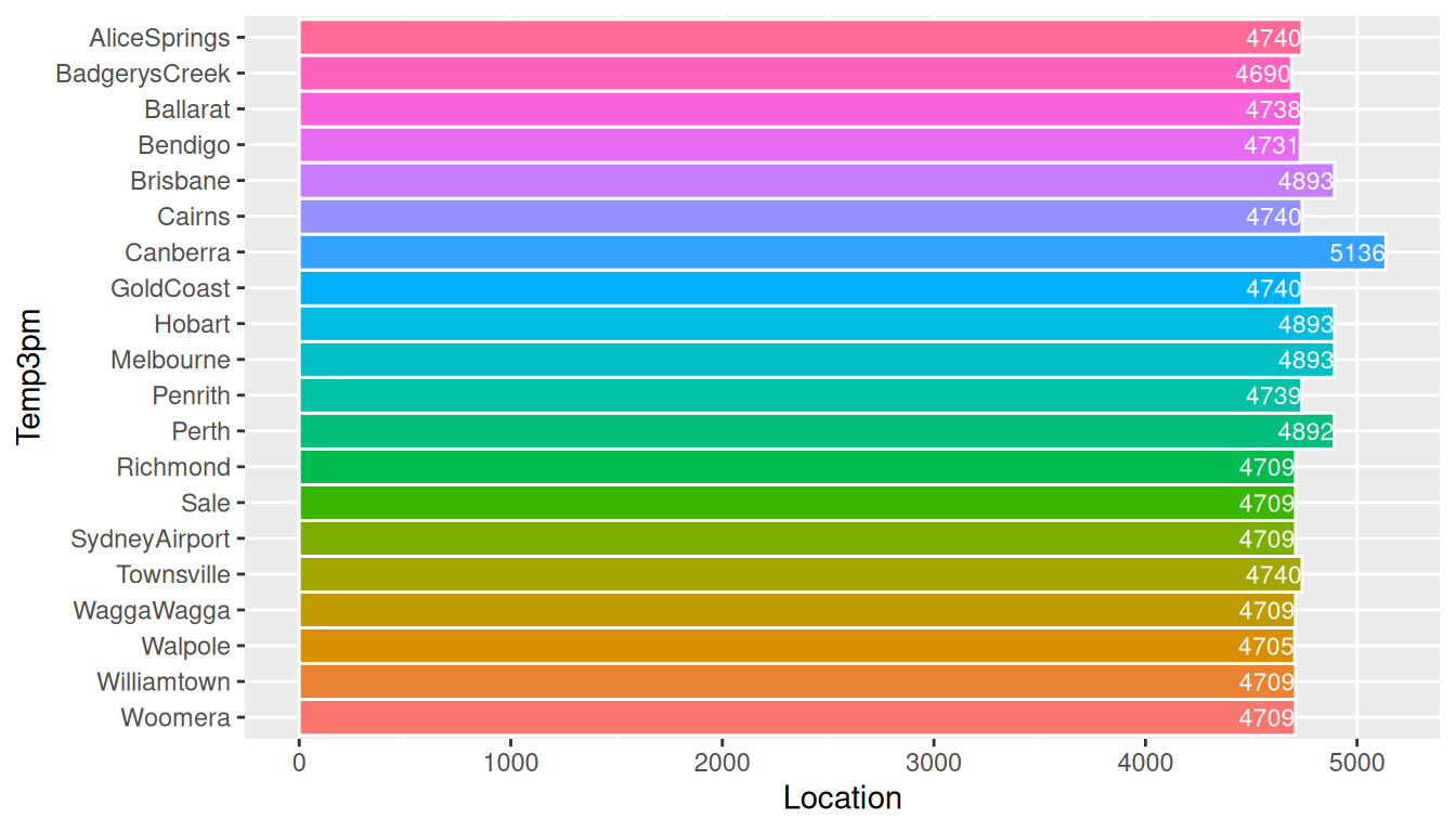
ds %>%
  filter(location %in% (ds$location %>% unique %>% sample(20))) %>%
  mutate(location=factor(location,
                         levels=(location %>% unique() %>%
                                   sort() %>% rev()))) %>%
  ggplot(aes(location, fill=location)) +
  geom_bar(width=1, colour="white") +
  theme(legend.position="none") +
  labs(x=vnames["temp_3pm"], y=vnames["location"]) +
  coord_flip() +
  geom_text(stat="count", color="white", hjust=1.0, size=3,
            aes(y=..count.., label=..count..))
It can be informative to show actual numeric values on a plot. This plot shows the counts.
Exercise: Instead of plotting the counts, plot the mean temp_3pm,
and include the textual value.
Your donation will support ongoing availability and give you access to the PDF version of this book. Desktop Survival Guides include Data Science, GNU/Linux, and MLHub. Books available on Amazon include Data Mining with Rattle and Essentials of Data Science. Popular open source software includes rattle, wajig, and mlhub. Hosted by Togaware, a pioneer of free and open source software since 1984. Copyright © 1995-2022 Graham.Williams@togaware.com Creative Commons Attribution-ShareAlike 4.0