11.6 Bar Chart Colour No Legend
20200428
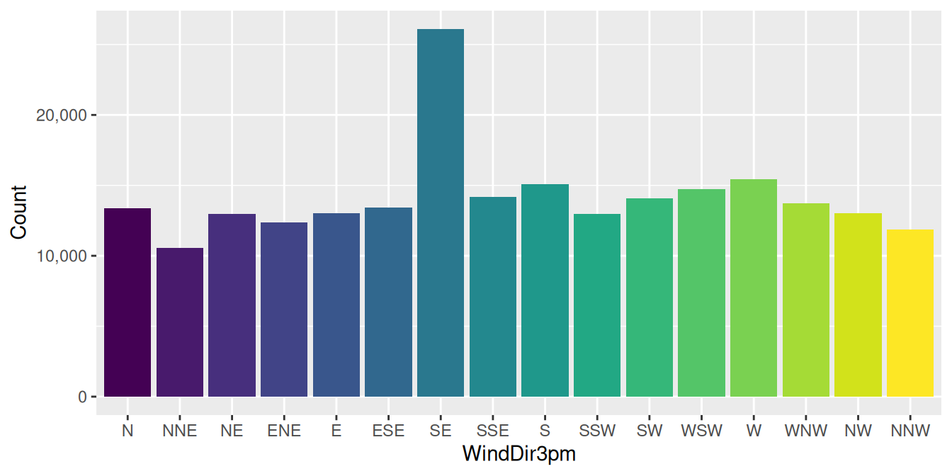
ds %>%
  ggplot(aes(x=wind_dir_3pm, fill=wind_dir_3pm)) +
  geom_bar() +
  scale_y_continuous(labels=comma) +
  labs(x=vnames["wind_dir_3pm"], y="Count") +
  theme(legend.position="none")
Colour can add interest to a plot, though (unlike this example) it is usually good to use the colour to communicate further information about the data. Nonetheless, it adds to the attractiveness of the visualisation.
A spread of colour is added through the aesthetic
fill=wind_dir_3pm. This will fill the bars with
colour controlled by the different values of the variable
wind_dir_3pm. As this is also the variable being plotted
on the x-axis a different colour is chosen for each bar from a good
default set of colours.
We add a ggplot2::theme() element here to remove the legend
that would be displayed by default, by indicating that the
legend.position="none". An alternative to turn the
legend off is to provide show.legend=FALSE to the
layer (i.e., ggplot2::geom_bar()). This then allows layer
specific control of the legends.
Your donation will support ongoing availability and give you access to the PDF version of this book. Desktop Survival Guides include Data Science, GNU/Linux, and MLHub. Books available on Amazon include Data Mining with Rattle and Essentials of Data Science. Popular open source software includes rattle, wajig, and mlhub. Hosted by Togaware, a pioneer of free and open source software since 1984. Copyright © 1995-2022 Graham.Williams@togaware.com Creative Commons Attribution-ShareAlike 4.0