11.38 Labels with Comma
20200428
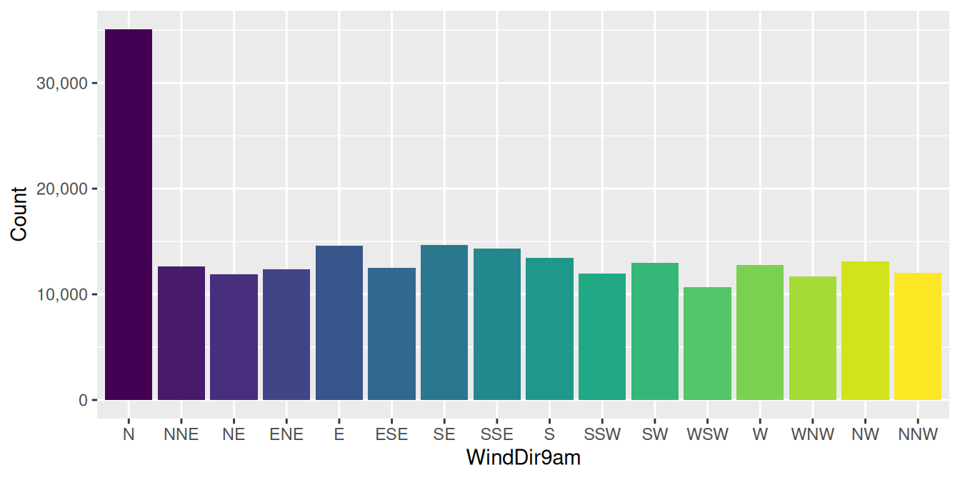
ds %>%
  ggplot(aes(wind_dir_9am, fill=wind_dir_9am)) +
  geom_bar() +
  scale_y_continuous(labels=comma) +
  theme(legend.position="none") +
  labs(x=vnames["wind_dir_9am"], y="Count")
With ggplot2 (Wickham et al. 2025) Version 0.9.0 the package introduced a mechanism to handle many of the scale operations, in such a way as to support base and lattice graphics, as well as graphics. Scale operations include position guides, as in the axes, and aesthetic guides, as in the legend.
The function scales::comma() is useful for presenting numbers
using commas to separate the thousands. This is always a good
idea as it assists the reader in quickly determining the magnitude of
the numbers we are looking at. As a matter of course, I recommend
commas in plots (and tables) at all times. To do so use the
ggplot2::scale_continuous() function with
labels=comma.
References
Wickham, Hadley, Winston Chang, Lionel Henry, Thomas Lin Pedersen, Kohske Takahashi, Claus Wilke, Kara Woo, Hiroaki Yutani, Dewey Dunnington, and Teun van den Brand. 2025. Ggplot2: Create Elegant Data Visualisations Using the Grammar of Graphics. https://ggplot2.tidyverse.org.
Your donation will support ongoing availability and give you access to the PDF version of this book. Desktop Survival Guides include Data Science, GNU/Linux, and MLHub. Books available on Amazon include Data Mining with Rattle and Essentials of Data Science. Popular open source software includes rattle, wajig, and mlhub. Hosted by Togaware, a pioneer of free and open source software since 1984. Copyright © 1995-2022 Graham.Williams@togaware.com Creative Commons Attribution-ShareAlike 4.0