11.30 Density Plot
REVIEW
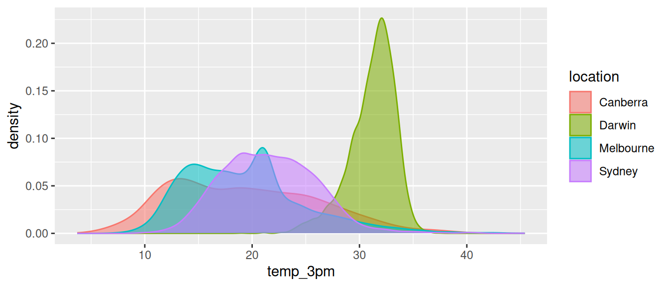
cities <- c("Canberra", "Darwin", "Melbourne", "Sydney")

ds %>%
  filter(location %in% cities) %>%
  ggplot(aes(temp_3pm, colour=location, fill=location)) +
  geom_density(alpha=0.55)
A Density Plot provides a quick and useful graphical view of the spread of the data similar to a histogram but with a smoothed estimate of the data distribution. The y-axis is a probability density function giving a view of where the values of the variable are concentrated. So peaks represent where the data values are concentrated and the number of peaks indicative of the modality of the distribution. We can also see the spread of the distribution of the data. The tails of the density plot provide information about outliers and skewness. Long tails suggest the presence of outliers, and the direction of the tail indicates skewness in the distribution (right-skewed or left-skewed).
Your donation will support ongoing availability and give you access to the PDF version of this book. Desktop Survival Guides include Data Science, GNU/Linux, and MLHub. Books available on Amazon include Data Mining with Rattle and Essentials of Data Science. Popular open source software includes rattle, wajig, and mlhub. Hosted by Togaware, a pioneer of free and open source software since 1984. Copyright © 1995-2022 Graham.Williams@togaware.com Creative Commons Attribution-ShareAlike 4.0