11.5 Bar Chart Basic
20200427
ds %>%
ggplot(aes(x=wind_dir_3pm)) +
geom_bar() +
scale_y_continuous(labels=comma) +
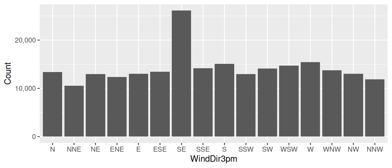
labs(x=vnames["wind_dir_3pm"], y="Count")A common and simple plot is the bar chart which displays
bars with a height that corresponds to the number of observations
having that value of the variable displayed on the x-axis. We use
ggplot2::geom_bar() to add a bar chart layer to a plot. Only
an x-axis aesthetic is required using ggplot2::aes() with the
x= option. The y-axis is automatically computed.
In our example we pipe the dataset on to ggplot2::ggplot(),
specifying the x-axis as the categoric variable
wind_dir_3pm (the x-axis). The count is automatically
determined from the dataset by ggplot2::geom_bar() which then
adds the layer of bars to the plot.
The y-ticks use commas with the ggplot2::scale_continuous()
function using the labels=``comma option. It is crucial that
for large numbers commas separate the thousands, so that the reader is
able to easily read the number. There can be catastrophic outcomes
from a misreading of numbers.
The x-axis and y-axis labels are set using ggplot2::labs()
with the x= and y= options. The x-label uses the
original dataset’s variable name as recorded in the template variable
vname (i.e.,
WindDir3pm). The y-label is set to be
Count.
Your donation will support ongoing availability and give you access to the PDF version of this book. Desktop Survival Guides include Data Science, GNU/Linux, and MLHub. Books available on Amazon include Data Mining with Rattle and Essentials of Data Science. Popular open source software includes rattle, wajig, and mlhub. Hosted by Togaware, a pioneer of free and open source software since 1984. Copyright © 1995-2022 Graham.Williams@togaware.com Creative Commons Attribution-ShareAlike 4.0