11.48 Scatter Plot Colour
20180603
set.seed(26439)
ds %>%
sample_n(100) %>%
ggplot(aes(x=min_temp, y=max_temp, colour=rain_tomorrow)) +
geom_point() +
labs(x = vnames["min_temp"],
y = vnames["max_temp"],
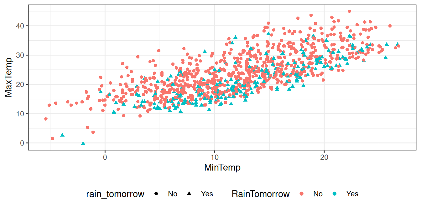
colour = vnames["rain_tomorrow"])A key variable in the rattle::weatherAUS dataset is
rain_tomorrow. By colouring the dots according to the
rain_tomorrow we may see a relationship in the
data.
The colour is added simply by specifying a further aesthetic,
colour=rain_tomorrow. This results in the
different values of the variable rain_tomorrow being
coloured differently.
Your donation will support ongoing development and give you access to the PDF version of this book. Desktop Survival Guides include Data Science, GNU/Linux, and MLHub. Books available on Amazon include Data Mining with Rattle and Essentials of Data Science. Popular open source software includes rattle, wajig, and mlhub. Hosted by Togaware, a pioneer of free and open source software since 1984.
Copyright © 1995-2021 Graham.Williams@togaware.com Creative Commons Attribution-ShareAlike 4.0.