7.10 kmeans visualise
20220225
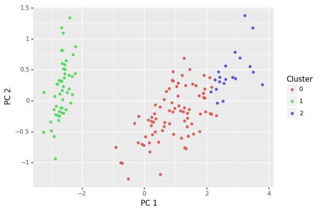
A visualisation of the predictions from the model provide a good indication of the quality of the clustering. The visualise command does that.
Common usage:
General usage:
The datafile is a csv format of data with named numeric columns and a label column. A visualisation of the cluster membership for each observation is generated.
If the dataset has more than two input variables, as is the case above, then a principal components analysis (PCA) is undertaken, and the two most significant components (PC1 and PC2) are plot.
A complete pipeline to cluster, predict and then visualise the clusters.
Your donation will support ongoing availability and give you access to the PDF version of this book. Desktop Survival Guides include Data Science, GNU/Linux, and MLHub. Books available on Amazon include Data Mining with Rattle and Essentials of Data Science. Popular open source software includes rattle, wajig, and mlhub. Hosted by Togaware, a pioneer of free and open source software since 1984. Copyright © 1995-2022 Graham.Williams@togaware.com Creative Commons Attribution-ShareAlike 4.0