8.6 apriori visualise 🚧
20220220
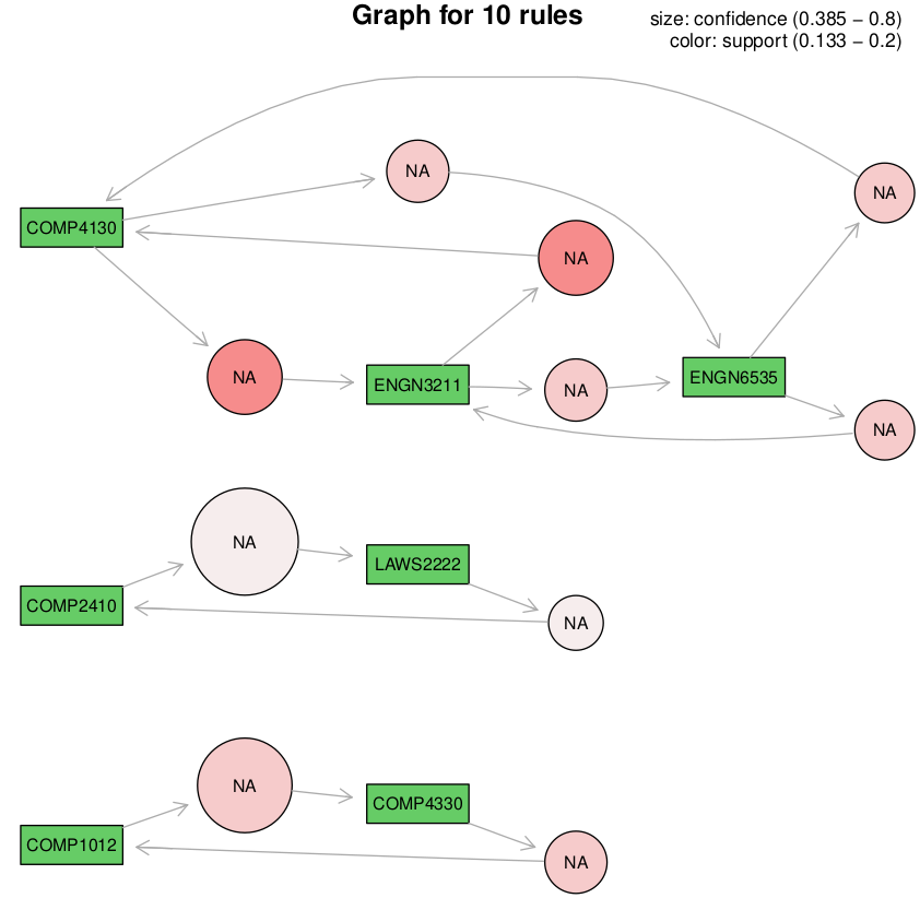
The association rules identified can be visualised as a graph.
ml visualise apriori [options] [file.rds]
     -c <measure>  --color=<measure>    One of support, confidence, lift.
     -n <int>      --number=<int>       Number of rules to display [10].
     -s <measure>  --sort=<measure>     One of confidence, support, lift.
     -t <tool>     --tool=<tool>        One of graphviz, ggplot, igraph.
     -z <measure>  --size=<measure>     One of confidence, support, lift.
Below we visualise the first 10 rules sorted by the support from the Master of Computing dataset where a transaction (a basket of items) is a program of study (a basket of courses)
The size of the circular nodes represent the confidence (the proportion of courses that include the right hand side items when the left hand side course are included in the student’s program of study) and the colour represents the level of support (the proportion of the programs that contain both the left and right hand courses).
For example, COMP4130 and ENG3211 occur frequently together (the different directions of the arrows between two course will always have the same colour) and ENG3211 is slight more indicative of COMP4130 being in the program that the other way around.
On the other hand, COMP1012 is clearly more indicative of COMP4330 also being included in a program the vice versa.
The visualisation has many options to choose from.
Your donation will support ongoing availability and give you access to the PDF version of this book. Desktop Survival Guides include Data Science, GNU/Linux, and MLHub. Books available on Amazon include Data Mining with Rattle and Essentials of Data Science. Popular open source software includes rattle, wajig, and mlhub. Hosted by Togaware, a pioneer of free and open source software since 1984. Copyright © 1995-2022 Graham.Williams@togaware.com Creative Commons Attribution-ShareAlike 4.0